

Eye Candy Optical is Canberra’s newest and funkiest optical store located in the city’s Mode3 building in Braddon. This is the spinoff company of Langley and Pino, a business established 30 plus years ago.
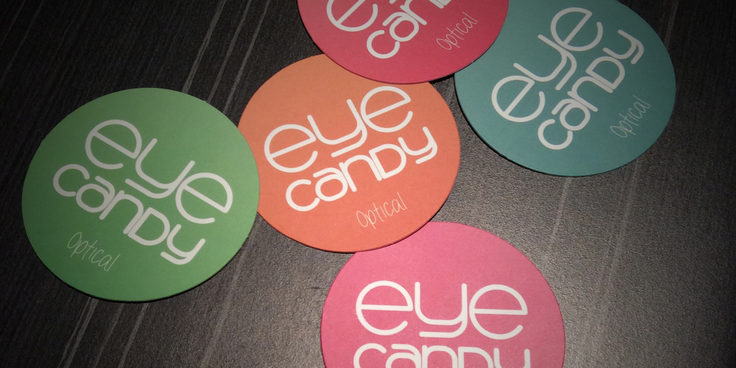
After our first project brief, we agreed that the branding approach needed to reflect the fun nature of the business while still retaining the high-end quality of their products and services. With only the “Eye Candy” name established, I created the whole branding image which starts with the logo. The logo is inspired by the mix of colours and round shapes seen in a bowl of candy.
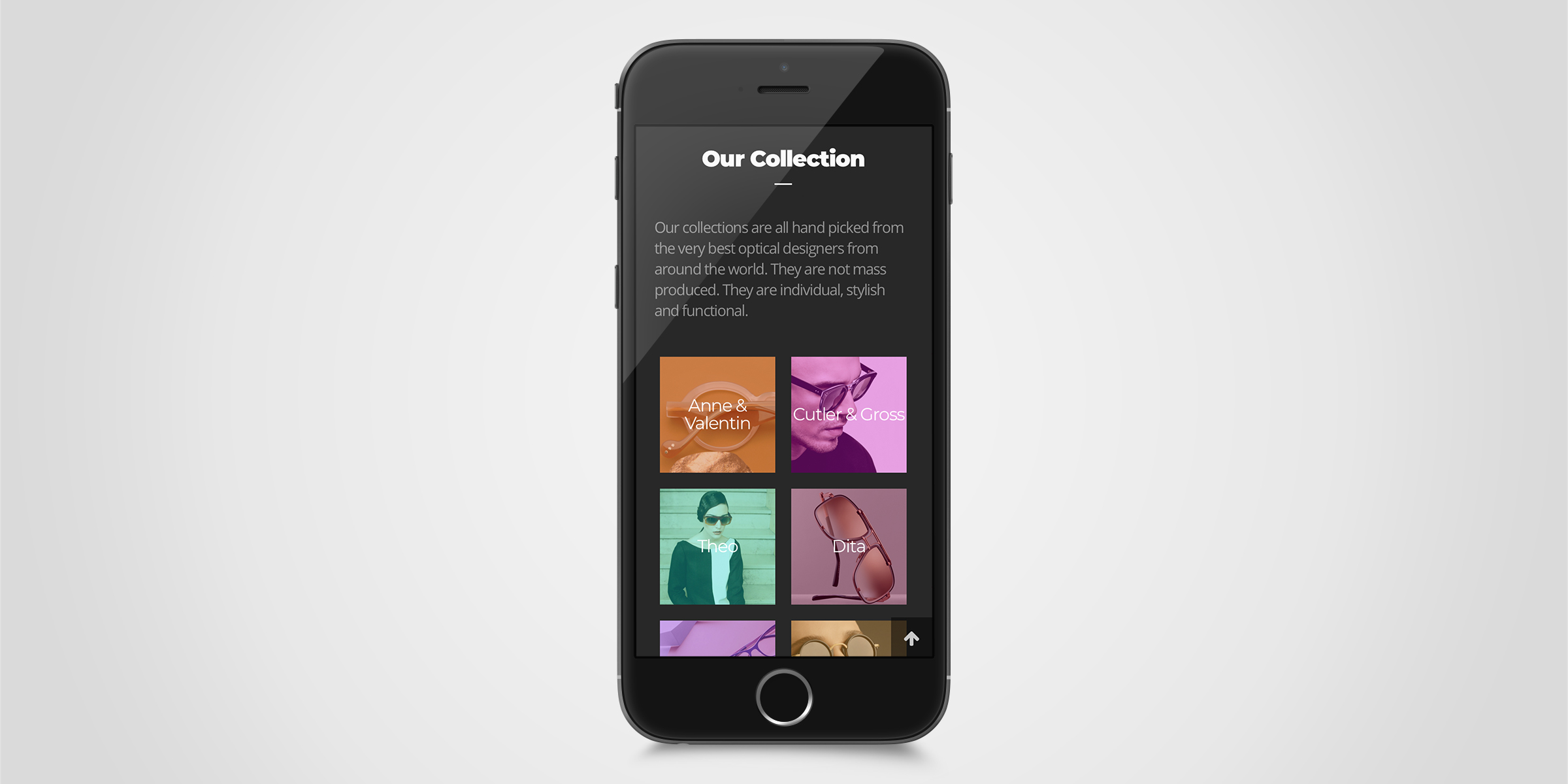
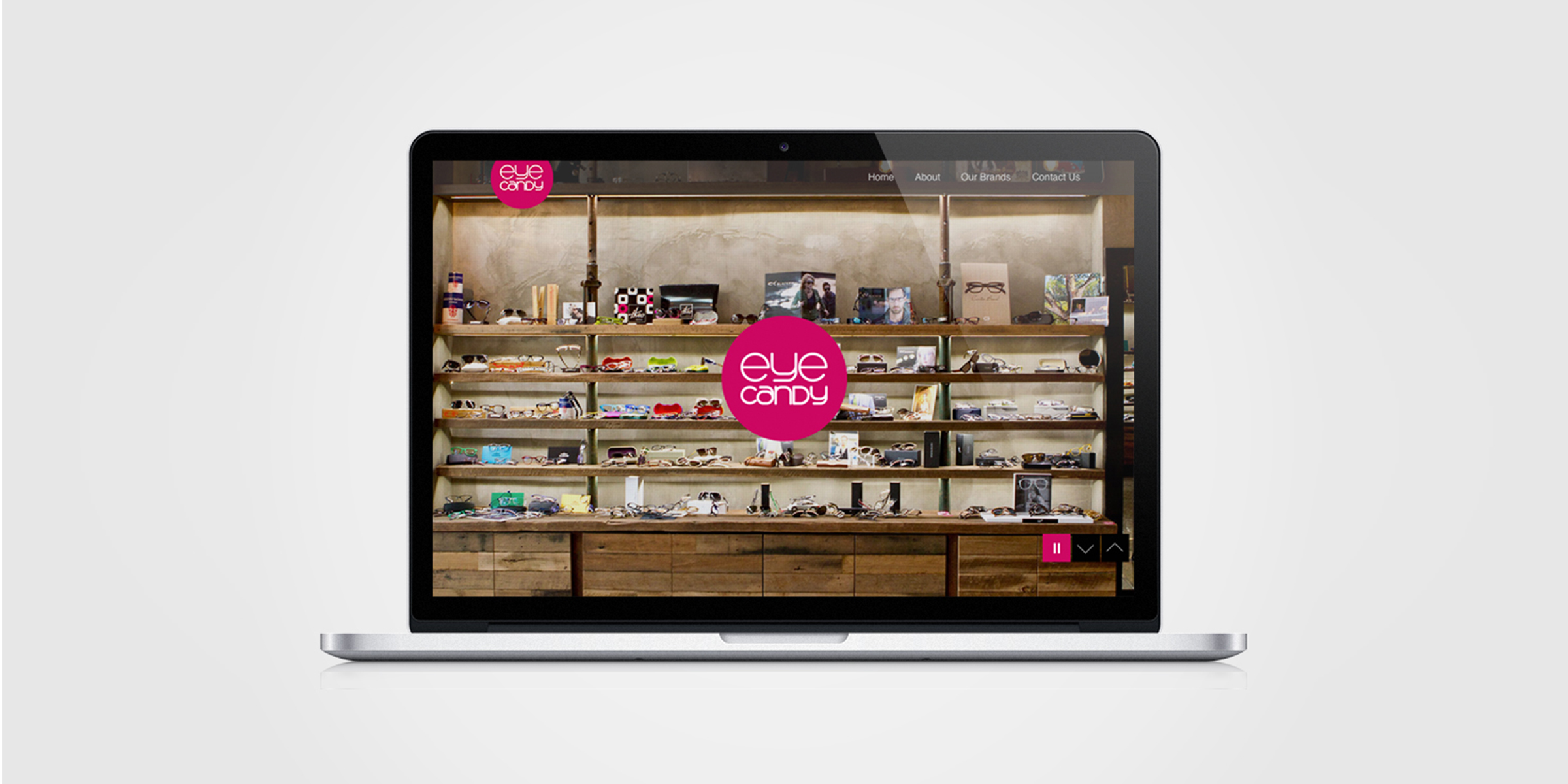
The website followed, with the use of large imagery to quickly show the website visitor what the style of Eye Candy was. The website encourages interaction with the business, by incorporating feeds from their Facebook and Instagram social media accounts. The round business cards that I designed, are scattered throughout the store to also reflect the “bowl of lollies” inspiration.
The complete branding package includes the specific typography and exact colours to be used in collateral of all kinds.
Date
December 03, 2014